


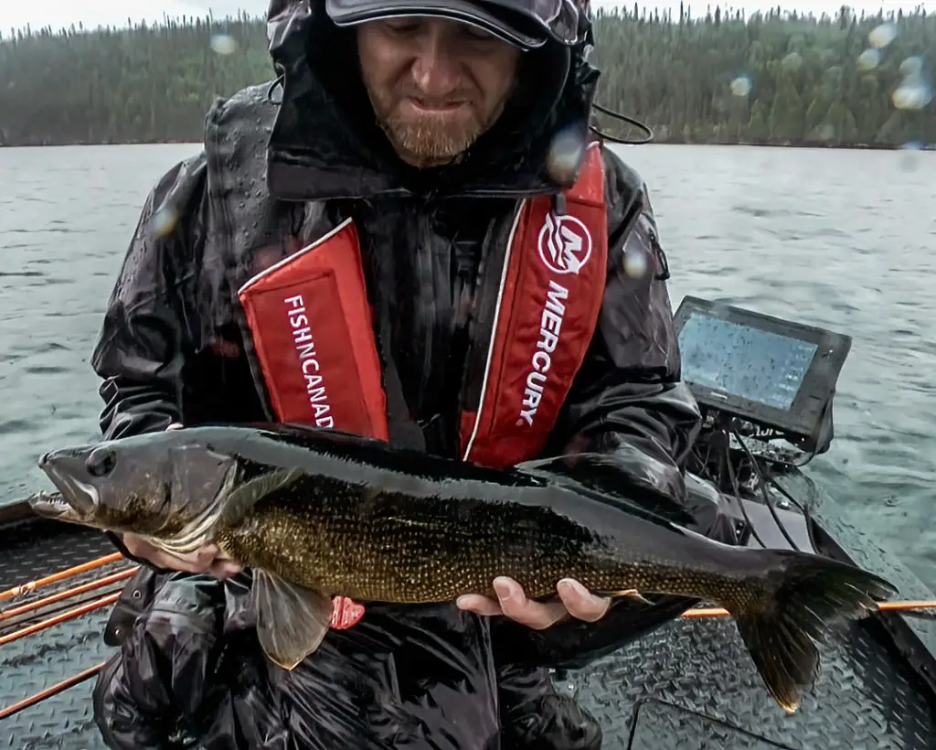
Presented by Garmin
If you haven’t noticed by now, we here at Fish’n Canada love our screenshots and, today, we are back with 10 more to break down for you!
If you missed out first set of breakdowns, be sure to check out Part 1 at the link below.
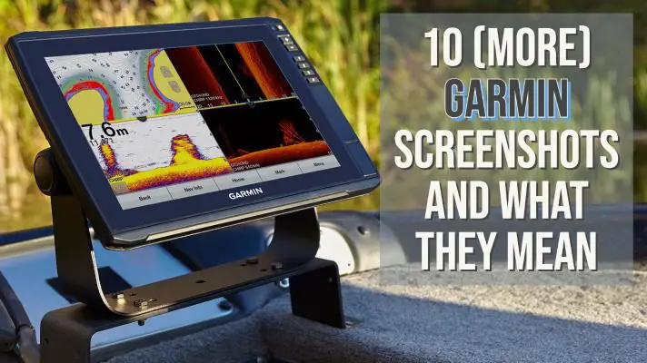
1 – Contour Mapping
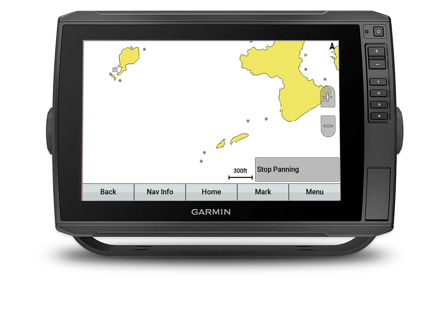
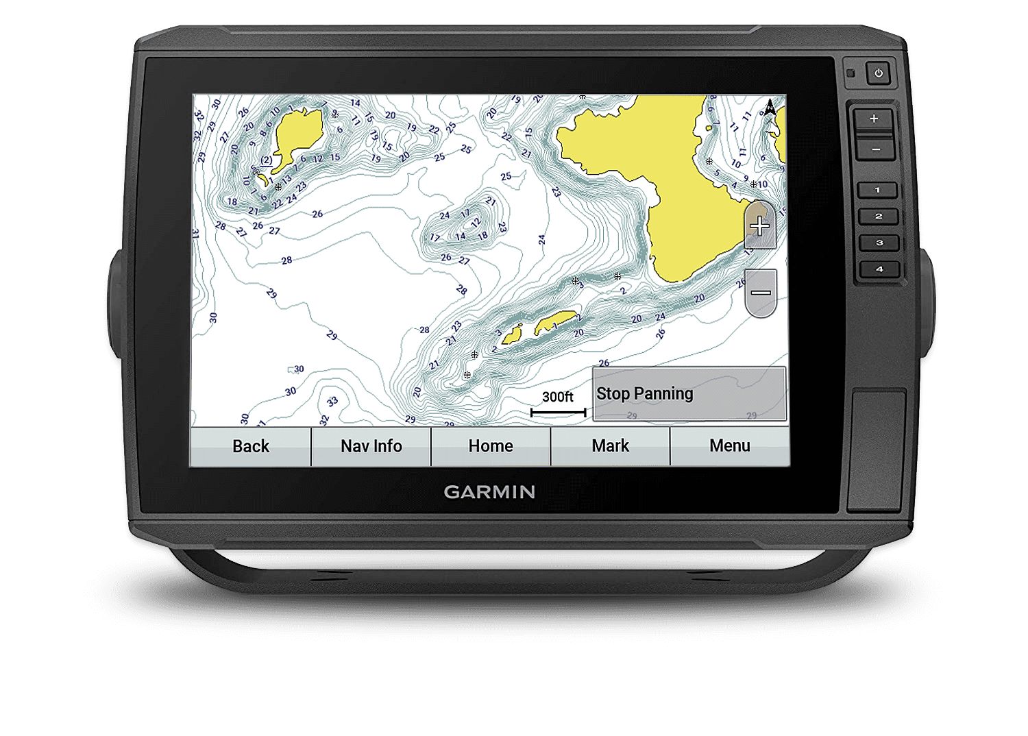
Analysis:
Here’s a trio of screengrabs that we put together to show you the importance of a good mapping system.
In the first screenshot, we see the most basic and primitive mapping. It essentially shows a bit of land and not much else.
In screenshot 2, we show the significant difference of laying in 1-foot incremental bottom contours. These captured contours have contributed to so many fish being caught around the world before a cast is even made!
Screenshot 3 is what we refer to as a piece of art with a touch of paint by numbers. By adding colours to the contour mapping (every 3-foot change is a different colour), anglers can easily see a specific depth range to either concentrate on or at times, avoid.
Garmin and Navionics are combining great minds to give anglers incredible bottom detail.
BTW, if you want to go even beyond screenshot 3, just turn on your Quickdraw feature and you’ll be creating the absolute best “on the water” picture available.
2) A Strip Of Fish
Analysis:
Here is a great example of using the “shadows” on a SideVu image to help figure things out.
In this case, the screen is showing a school of Crappies. By being suspended, these fish are showing shadows on the opposite side of the boat’s path. This is simply the way that side imaging works. It shoots out a signal from the transducer, 90 degrees to the boat’s running path.
This school of fish is odd in that it is more of a longer, thin grouping vs. the “usual” round, robust-looking school. The shadows exaggerate this long and lean school even more.
Regardless of the shape of this school of fish, if you are in Crappie mode, it’s a must-hit!
3) LiveScope Plus
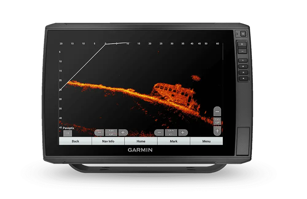
Analysis:
Well if this image doesn’t take the cake, then nothing will. Check out the detail in this screenshot.
Anglers with an eye for this kind of imagery would at first think it is from a Clear Vu or Side Vu shot, after all, that’s the only way possible to get such detail, right?
Well, Garmin’s new LiveScope Plus just gave users a 35% better picture than the one they have already been using. The above image is a direct result of this new technology.
This new “Plus” offers improved resolution, reduced noise, clearer images and better target separation.
You can purchase a new system which includes both the LiveScope Plus LVS34 Transducer and GLS10 Black box or, if you already have the original LiveScope, you can with just the purchase of the LiveScope Plus LVS34 Transducer.
Garmin says: “With live sonar this clear, it’s easier than ever to see your lure, bait, or fish swimming around your boat”.
Fish’n Canada says: “CAN’T WAIT!”
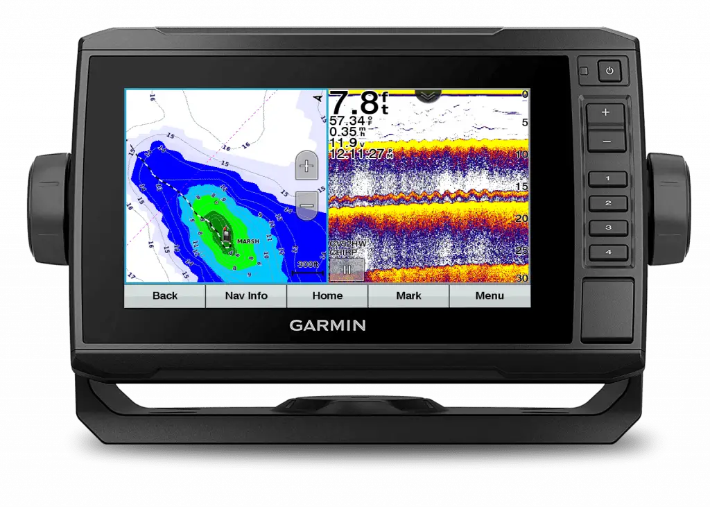
4) Three Views, One Screen
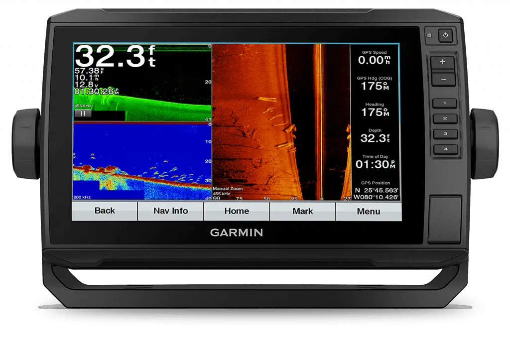
Analysis:
This screenshot was captured by Garmin showing 3 separate windows plus extra data all on one unit.
On the top left is their ClearVu screen, on the bottom left is their traditional screen, to the direct right of those is their SideVu screen and finally a data screen.
If you look at the traditional screen first, you’ll see lots of fish, especially in that 25-30 foot range. Now take a close look above at the ClearVu screen. As you can see, the fish still show up but in a very different forum. You should study this “fish picture” and get used to it since the ClearVu mode is much better at showing structure and cover. By recognizing fish, along with a clear view of the surroundings, you move well ahead of the game.
Finally, check out the SideVu screen. Totally different from the other two right? Now you can see what those “bumps” are (logs) on the left screens by the detailed view from above. These three screens work in synchronicity with each other.
The bonus data screen shows six different functions. Anglers can change any and all of these to suit their needs. They can also delete that entire data area in order to use up more real estate showing the fish finding or mapping screens.
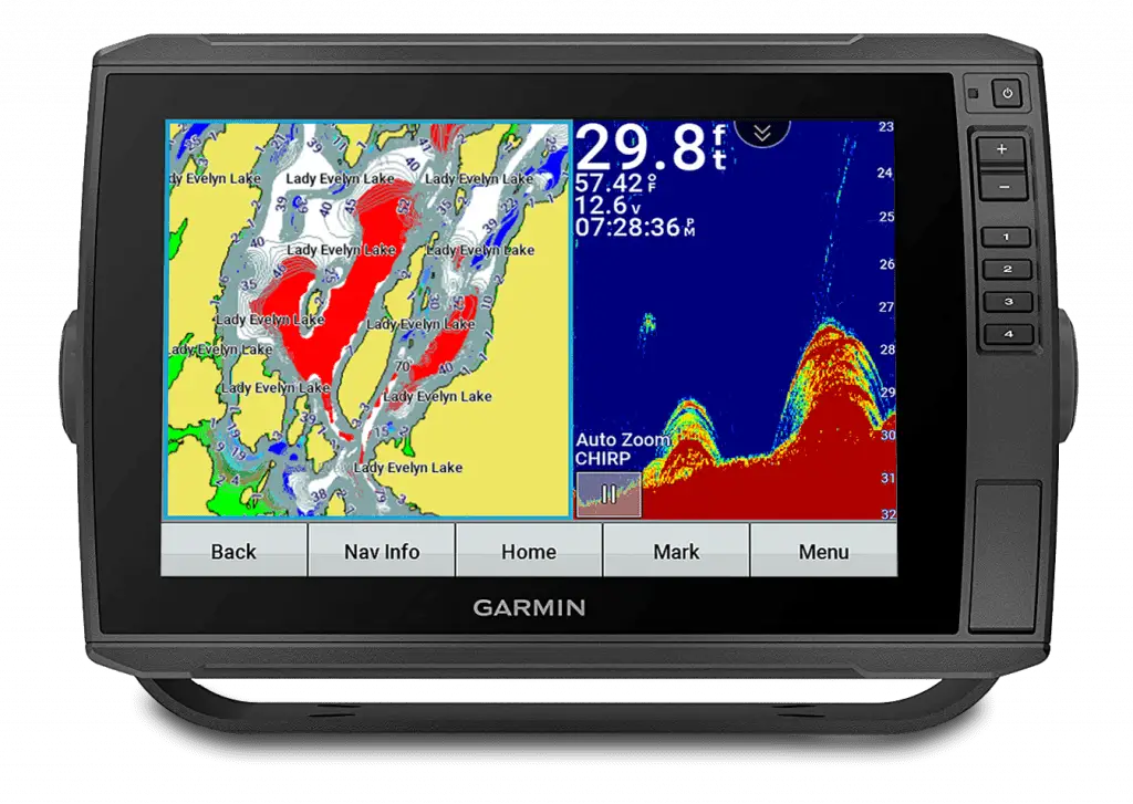
5) Lady Evelyn Lake
Analysis:
This is a screenshot that we captured on Lady Evelyn Lake in northern Ontario while on a recent Fish’n Canada shoot. We were targeting both Walleye and Smallmouth Bass.
Lady Evelyn is a complex body of water with a vast amount of bottom structure which is absolutely perfect for our intended species.
For this reason, on our mapping screen, we have added in what is called colour shading to specific depth numbers.
A simple version of this would be 5-foot increments. That means every 5 feet in depth is marked with a specific colour.
E.G.:
1-5 feet deep = green
6-10 feet deep = yellow
11-15 feet deep = red
16-20 feet deep = blue
This creates a band of colour that is easy to see, ESPECIALLY when zoomed out. Then we can find nice little sub-contours that often work out to the “spot on a spot”
As for the traditional fish finder screen, this area was loaded with rocks and boulders, a bit of weeds and a bunch of Smallmouth with the odd Walleye mixed in.
The bumps could very well have been single rocks or boulders and we perceived some of the arches as fish (the repeated, close-together, weak arches could have been false readings but the strong ones were fish). Whenever we saw this and dropped our presentations down, often it was followed by a hookset into a Smallie.
The moral of this screenshot is to utilize the mapping software as best you can and when you see a traditional screen like this one, get fishn’!
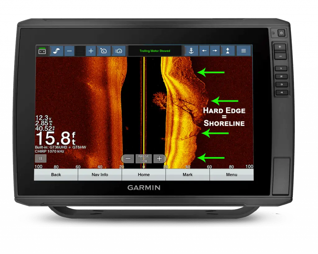
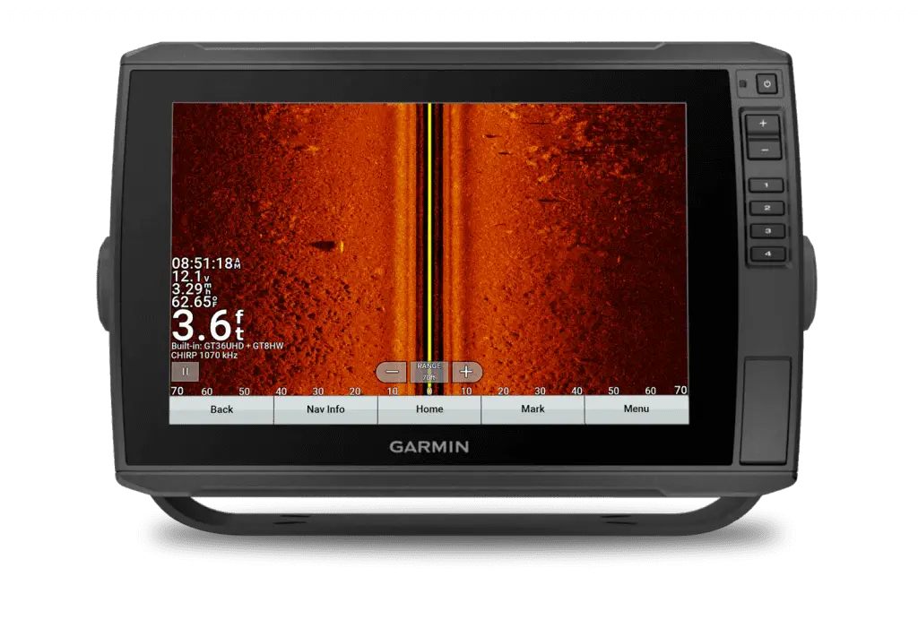
6) Submerged Tree
Analysis:
Here’s one of our favourite screenshots we have ever captured. It’s simple yet it says a lot.
The most obvious feature in this SideVu shot is the incredible detail in the submerged tree on the right side. The bright lines are the actual branches while the darker lines represent the shadow of the branches, trunk etc.
Although hard to see, if you zoom in you can see some bright “specks” in the tree. These are panfish (probably Crappie and or Sunfish).
Above the “zoom-out ” button you will see another small school of panfish.
There is also a small tree below the main tree on the same side.
At the top of the screen on the menu bar is the Garmin Force trolling motor bar. Not only can you see the status of the motor (in this case “stowed”), but you can actually run your motor by touching the menu bar directly on your screen. Very cool!
The line highlighted by the arrows is the shoreline where the water meets land. As you can see on the left side there’s no line. That means it is all water that is being read.
Although this is super easy to figure out on the water (since you can literally see the shoreline), it becomes a handy feature when studying your screenshots at a later time.
Every little bit of info helps!
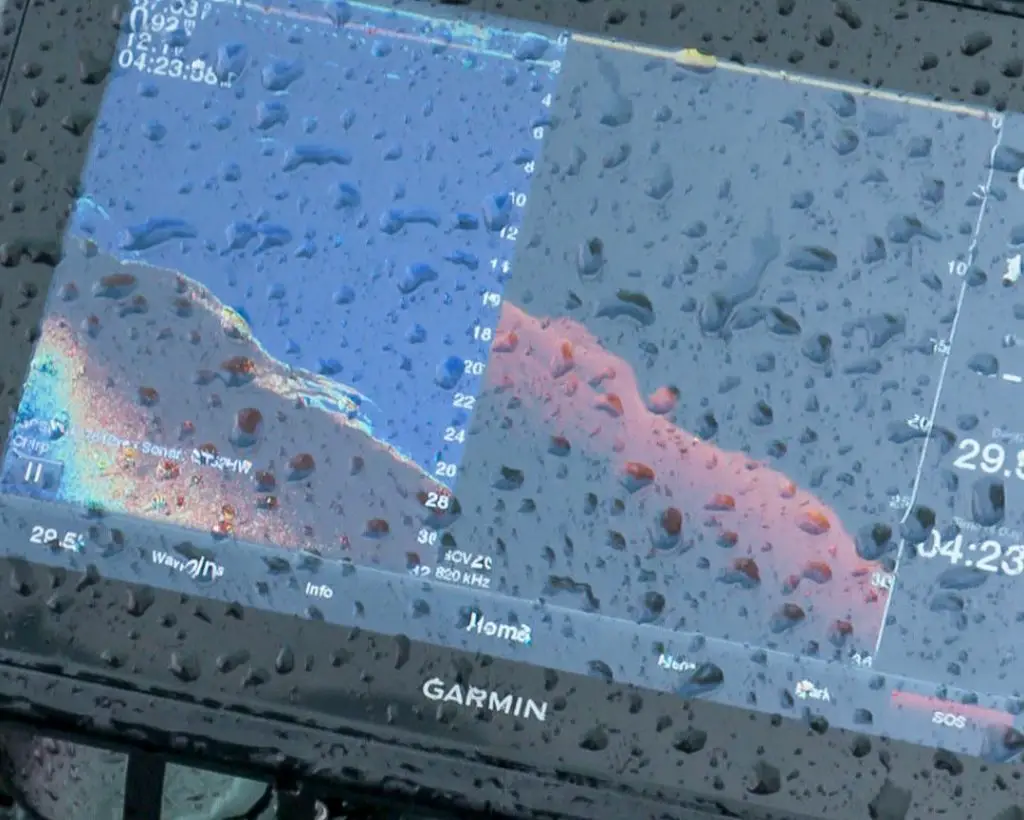
7) Rainy Day
Analysis:
Technically this is not a screenshot but, since it is a shot of our screen, we’re gonna’ use it.
We used this image of our bow Garmin to show that an angler can and should utilize the best screens possible and not to use screens that can’t aid you in helping understand what’s going on below.
This one is all about what’s happening above the water… the rain.
As you can see on the left side, the traditional screen is beaming with light, colour and detail. Including that small school of Walleye locked close to the bottom.
Looking over to the right-hand side, the ClearVu screen is much more difficult to see as the raindrops are directly over the area where the fish are. Yes we could have, and indeed did wipe the screen, but with the relentless rain, it quickly loaded up again repeatedly with drops. We could also have played with the settings to brighten up the ClearVu image and even changed the colour palette but with actual fish signals sometimes being harder to see on ClearVu than on traditional, why struggle?
In this instance, we suggest doing one of two things.
First is changing over to a split-screen of a traditional and a fishing map combo. That way you will complement your traditional screen with either the Garmin map or your Quickdraw map, whichever you are running.
The second option (which we eventually did since we were fishing a small, distinct area and the rain wasn’t about to stop), was to simply change over to a full screen on traditional mode. In this day of so many options to view fish, structure and cover, one must never forget the effectiveness of the traditional screen… It’s part of how we all got started in the world of understanding fishing electronics.
Take advantage of and use all the tools available.
8) Submerged… something
Analysis:
We’ll be 100 percent honest with you, we have no idea what it actually is. We know it’s man-made, maybe some kind of machinery, maybe a metal cabinet etc., and that somebody put it there either accidentally or on purpose.
As well, we know the viewing mode was in DownVu.
A final thing we know is, as with most man-made structures, they attract fish… and often lots of em’! As you can see from all the dots here, this baby was loaded with panfish like the ones pictured above.
Do you have any stories as to fishing on man-made structures and tearin’ em’ up?
We’d like to hear them.
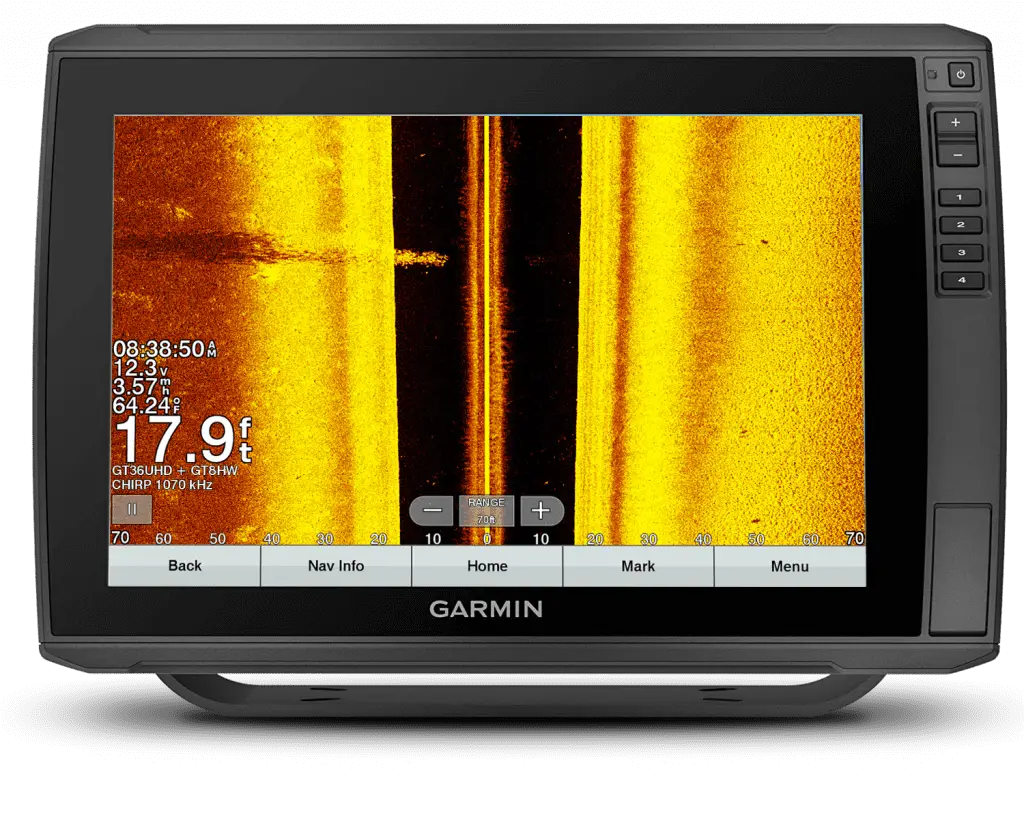
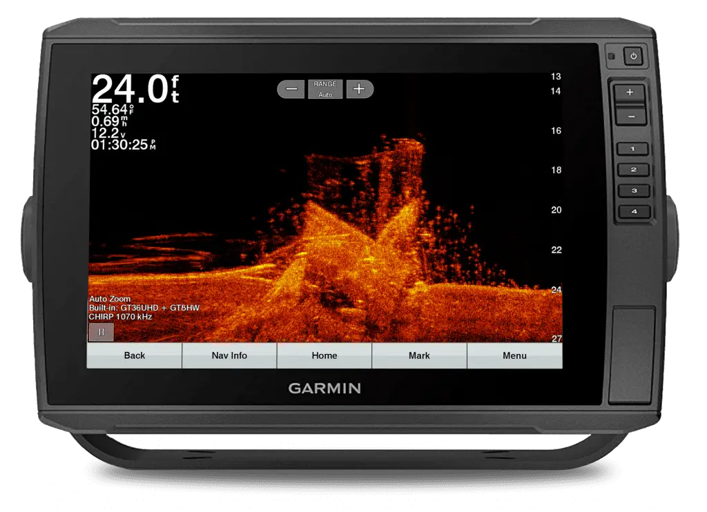
9) Triple Echo:
As with the crazy-looking traditional screen here, with a hard-bottomed lake and a powerful transducer, it is not uncommon to have a second or even a third bottom reading (echo).
In this case, it was simply a range setting issue in which the guys were fishing the deeper water (see chart side of screen) out off of the hump. They were on manual range to keep the bottom exactly where they wanted it on their display. When they picked up to move shallower, on top of the hump, they simply didn’t change their range.
If this shows up on your screen, then you panic and don’t remember how to reset your range, just remember that the upper or first bottom reading on your screen is the proper depth.
Incidentally, some anglers “look” for a second echo to see how dense or hard the bottom is.
10) Spotting Shadows
Analysis:
Have you ever seen such a pretty sight???
For sure it’s a big fish on the left side. Check out that awesome shadow BTW. We were hoping for a gigantic Smallmouth but there were also Largemouth in the area as well as a bunch of Carp.
Since we failed to make the capture… let’s call it a Carp… HA!!!
Conclusion:
As we have said time and time again, modern chart plotters are far more than just devices to show you where fish are located, they are also excellent learning tools. Taking the time to study our screenshots after a day on the water has undoubtedly made us better anglers and has allowed us to see countless things that we missed when on the boat.
If you want to learn from our screenshots, be sure to follow us on Instagram for more #ScreenshotSaturdays!
2 Responses
What a Machine!
Rock on bud!